fostering trust between users and app through an emotional approach
The Rede Expressos app is designed to simplify the travel experience by allowing users to search for routes and schedules, purchase bus tickets, manage bookings, and access digital tickets directly on their smartphones while in Portugal.
the problem
The current app is built for efficiency. The process of buying a ticket is, in its majority, direct, functional and fast, which is great for users who are buying last-minute tickets or want to get it done as fast as possible. But, outside of relieving momentarily the user's state of hurriedness, stress and anxiety, there isn't much more to it. It's a deeply impersonal experience.
An app that resembles a "good" physical ticket machine. But with that in mind, if another competitor has a similarly effective "machine" for a lower price, what's keeping them inclined to use this one?
the process
- research
I recurred to Embodied Research in order to better understand what kind of feelings might bring a user back to a product. For that, I documented my activities during one day: going to the gym, working on this project, going for a drink, amongst other things. I took notice of how I felt before, during and after, how my body felt, how I held certain objects.
Going through my to-dos, even when feeling lazy or a little down, I reaped the benefits of it after doing them, outside of the experiences themselves, and that's where I felt the best, that was what I reaped as a reward. I felt that following through all of that was worthwhile, valuable and intelligent.
This way, I found the emotions that I could potentially bring into the app experience.
- positioning
Notifications, gamification and even an assistant were considered, but I decided to look deeper into what the bus experience by Rede Expressos could offer, and I came across everything I was looking for: the RFlex.
RFlex is a free customer loyalty program offered by Rede Expressos that rewards frequent travellers with discounted ticket prices and special benefits across the company's bus network. The service works in a 365-day cycle, where the traveller has discounted prices up to 50 ticket purchases, with the discount rising to different "ranks", up to 65%.
This was the perfect opportunity to completely transform the Rede Expressos app experience by asking:
How might we increase hurried users' awareness of available discounts in order to make them feel like smarter consumers?
the solution
The most impactful changes in the app would be:
- Designing an Onboarding
- Rearranging the My Profile Section
- Change a few details in the Search and My Tickets Sections
- A small tinker in the Ticket Purchasing journey

1. an onboarding was a must, since it was non-existent, and so an onboarding experience was created where the user would be aware of the RFlex advantages since the first screen, and invite them through a fluid and quick sign up for the loyalty service. Since the RFlex is completely free and has no strings attached other than filling the data, I took advantage of that to reinforce its low friction.
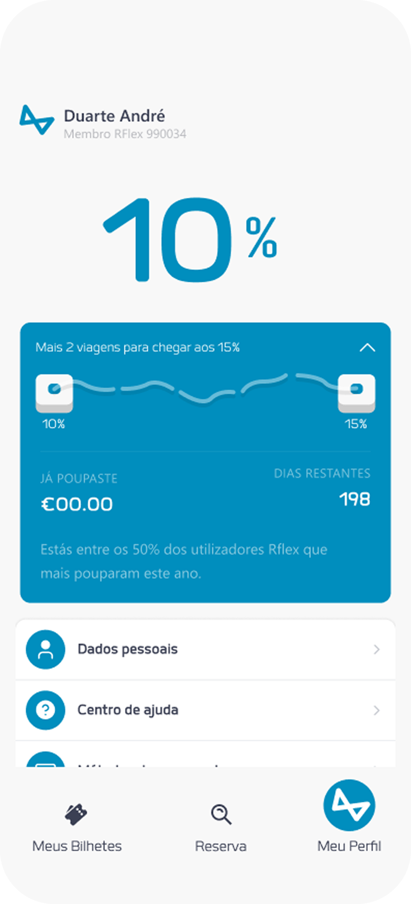
- I reworked it, by changing its icon in the navigation bar at the bottom, breaking down all the menu items into categories, where the features would exist inside a submenu, and come up with a new way to present the users' progress in the programme, by highlighting the current active discount and adding a dropdown with information about progress, time left in the yearly cycle, and how much money was saved so far.
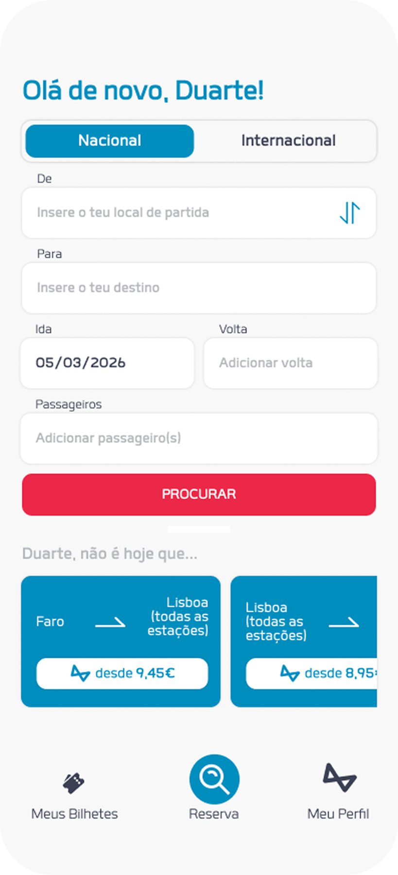
3. Search and My Tickets sections were a bit more discreet, but changes were made in order to keep RFlex's presence and some form of its benefits always visible. For the first, the change happened in the "Suggested Trips" the original version had. They were disconnected from the user's reality, basically a selection of random trips across the country. Since the app can save trip history, I turned it into a "Trip History" style of section, where the most recurrent trips are shown in form of one-click search, showing its lowest RFlex price in the card.
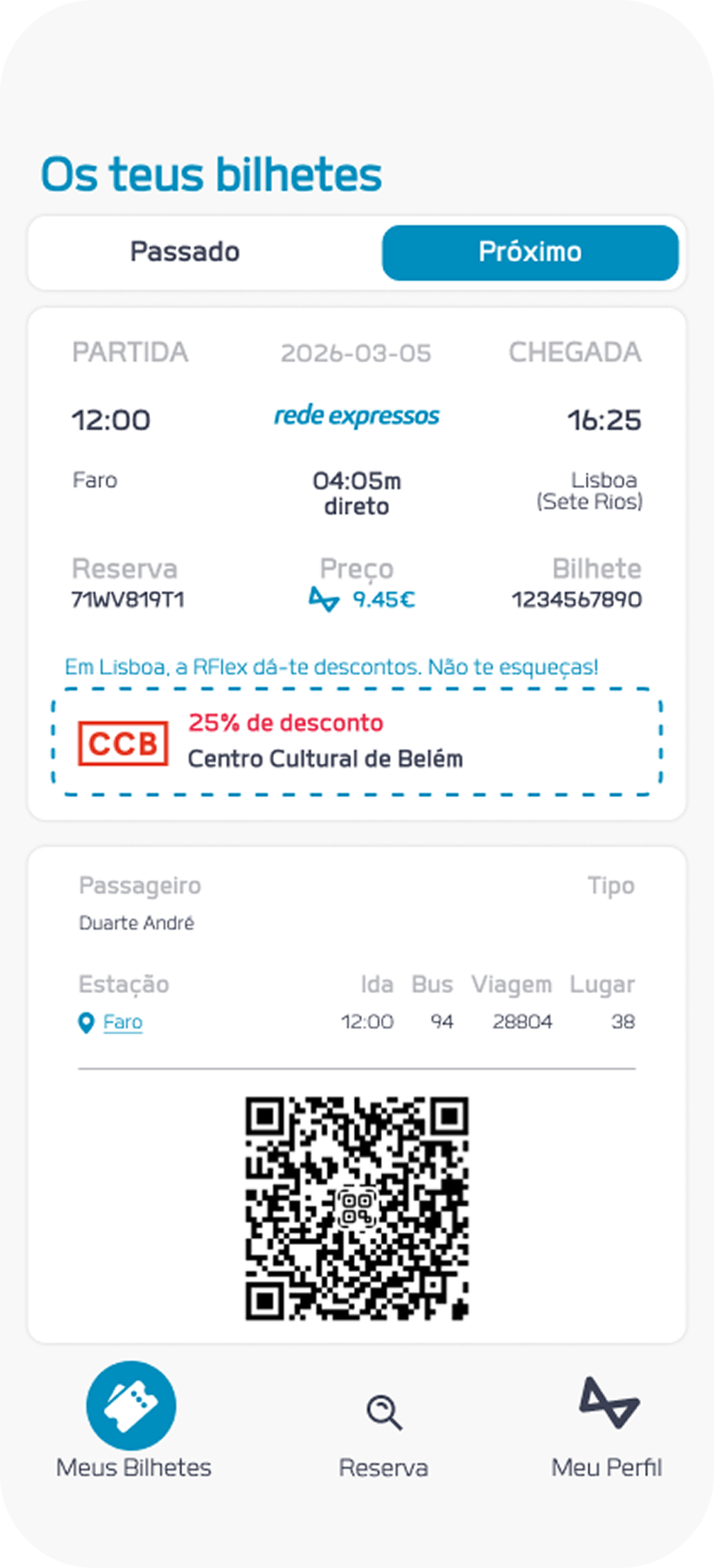
As for the My Ticket section, it is a section that the user consults while boarding the bus, so I saw it as a great opportunity to place the partner's discounts inside the ticket itself, as a reminder that the benefits go beyond the bus ticket.
Since there's over 20 partnerships with discounts, it is difficult to give this information to the user without being forgettable or overwhelming, and so I added a coupon-like snippet to the ticket, where one partner, geographically relevant to that ticket's destination, is shown.
Since there's over 20 partnerships with discounts, it is difficult to give this information to the user without being forgettable or overwhelming, and so I added a coupon-like snippet to the ticket, where one partner, geographically relevant to that ticket's destination, is shown.
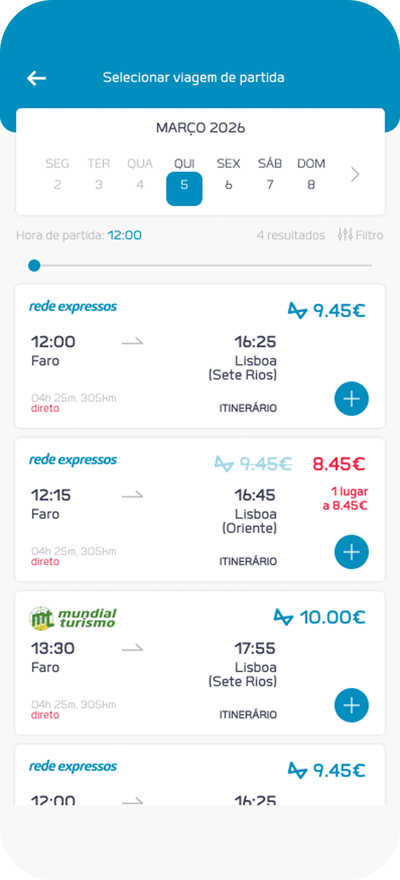
4. The purchasing journey, given how effective it is, was something that I refrained from tampering with, but I couldn't stop experimenting with the trip option cards. The prices vary, and in the original app, when logged into RFlex, the price is affected, but it is not shown to the user. The changes here are to show the service working visibly, by highlighting the price into a blue colour, accompanied by the designed logo.
conclusions
To evaluate the impact of this proposal, I looked into Emotional Design's three main components of Delight:
- Visceral— With a little cleanup to the app's layouts, changing the electric light blue to a more eye-friendly blue, and adding some animated and interactive elements provide a more pleasurable experience and impression on the user.
- Behavioural — By having a copy that refers to the user, bringing up elements that are somewhat gamified, and granting a sense of progress towards a bigger reward (a bigger discount, or the feature that shows how much you save in total for buying as a RFlex member), motivates the user to keep following it through.
- Reflective— The benefits go beyond bus trips, and the user, every time they look at their ticket, are reminded of, for example, the 25% discount they have in one of Lisbon's biggest museums. These moments of benefit that are unrelated to bus trips will remind them of the benefits they get from using the Rede Expressos app and the RFlex service.
give other works a check